— Written by
Ed Orozco
—
March 22, 2024
Comments in triage
And UI improvements.
Comments in triage
You can now add and see comments on issues in the triage screen.

Home button
There’s now an explicit button in the navigation bar to return home

Home screen improvements
We simplified the layout and visuals of the home screen to make it more comfortable to read.

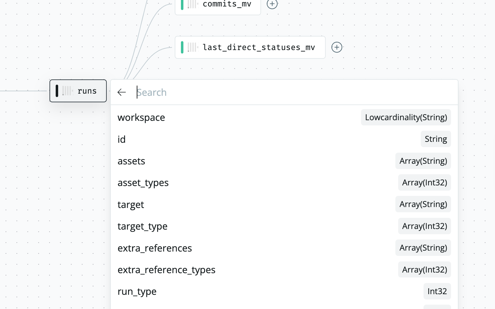
More room in the column selector in Lineage
We enlarged the column selector menu in lineage to show more of the names of your fields. If the field name is longer that the available space, the full name still appears on hover.

Build with data you can depend on
Join the data teams delivering business-critical impact with SYNQ.
